• Home
  • Contact
  • Service Offers
    • Advice
    • Training
    • Support
  • May 24, 2013

Made to Measure KPIs

Practical help with KPIs, measures and reporting

  • Tips
  • Tools
  • How To
  • Checklists
  • Design tips
  • Opinion
  • Reviews
  • Buy BlinkReporting
You are here: Home / Post / Design / Why my phone bill is brilliant.

Why my phone bill is brilliant.

August 24, 2011 By Bernie Leave a Comment

I’ve just had a bill through from Virgin. It’s not often I find myself smiling when I look at a bill, but this one was a bit different. Virgin have redesigned the bill and put a nice explanation in there as well, see this image (click on it for a bigger version)..

A brilliant piece of communication

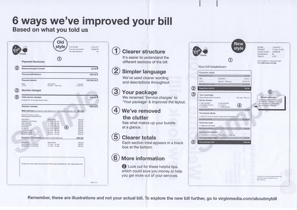
I like this on several levels:

1) There’s a clear rational reason for the change

2) The points they make for change are almost 100% applicable to dashboard and report design. Here they are again..

  • Clearer structure
  • Simpler language
  • Your package – relevant to you
  • Removed clutter
  • Clearer totals
  • More information

3) Great use of side-by-side visual comparison

My only criticism is that the stated aim of “remove clutter” is undermined slightly by the use of extra guide lines and boxes.

Well done Virgin, now if only my gas supplier could make their bills simple enough for real humans…


Related Posts

  • Smooth bottoms and dashboard designSmooth bottoms and dashboard design
  • A quick way to make horrific-looking, unreadable reports.A quick way to make horrific-looking, unreadable reports.
  • 30 Second Tip: Do the “blink” test on your reports30 Second Tip: Do the “blink” test on your reports
Zemanta

Bernie

Bernie has helped his clients deliver surprising levels of improvement across a wide range of industries over the past 15 years. His mission is to help clients with a repeatable, practical and jargon-free method for generating insightful and clear KPIs and management reports. He understands that most people don’t get excited by KPIs, but believes it’s a curable condition.

More Posts - Website - Twitter - LinkedIn

Share this:

  • Email
  • Print
Filed Under: Design Tagged With: bill, clarity, dashboard, invoice, layout

Speak Your Mind Cancel reply

*

*

Get new posts by email…

Return to top of page

Copyright © 2013 Made to Measure KPIs · Log in

loading Cancel
Post was not sent - check your email addresses!
Email check failed, please try again
Sorry, your blog cannot share posts by email.